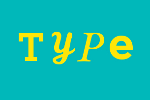
Do you have any friends or colleagues who are graphic designers? If so, you must know that they are passionate about typography (the art and technique of arranging letters). A designer’s passion allows them to look at the world in a different way. They can’t simply walk past a sign on the street: they will look at the choice of typeface, the colours, the spacing between each letter and consider how everything works together. At first glance, designers can tell the difference between a sign that was created by a professional or simply thrown together by someone using a PC.
When developing a logo, sign or any type of marketing materials for that matter, it’s critical to put serious thought and research into the typeface(s) you select. Neglecting to do so may put your organization at risk of looking unprofessional. When the proper process has been followed, the right typography will enhance/sync your brand for your target audience. It will also help people understand what your brand represents.
You may want to take a look at your marketing pieces to see if they accurately represent your brand. Here are a few questions for you :
1. Is your typeface inconsistent with your brand?
I have many examples of brands that are doing this wrong, but here’s one. Just last week, a few members of the 108 ideaspace team attended a Social Media Week event at the Windsor Arms Hotel. If you haven’t been to the Windsor Arms Hotel, it’s a very elegant, sophisticated and historic building. As we were standing outside their restaurant, “The Living Room”, we glanced at their sign and the first thing one of our designers said was, “What’s up with that Papyrus typeface on the mirror?” Obviously, a graphic designer did not design this signage. The Papyrus typeface is neither elegant nor sophisticated, but it’s a kitschy 80s typeface that is out of place in that fancy hotel. To me, it says they have cut some corners by not engaging a professional designer for their signage and they don’t fully understand their own brand. By the way, there is a blog site that is dedicated to exposing overuse of the Papyrus typeface: http://papyruseverywhere.tumblr.com.

2. Is the typeface stretched or squeezed?
This is a huge pet peeve of many graphic designers, including myself. Sometimes non-designers do this as an attempt at being creative or trying to save space. However, by stretching or squeezing the type, you are actually distorting the letterforms and original beauty of its shape. If you want to have a more condensed typeface, consider using a condensed letterform. The shapes of the letters will be balanced and more pleasing to the eye.
Another way around this is to research some typeface families that come in a variety of weights and styles (i.e. regular, italic, bold, condensed, condensed italic, bold italic, light, heavy, light italic, heavy italic, etc.) With this option, there is still a sense of unity because the typefaces belong to the same family.

3. Do you have bad kerning?
Kerning is the practice of adjusting the space between each letter in a word. Simply typing out a word isn’t always enough. The space between each character should be manually adjusted to create a more harmonized look. Overlooking this step can create an unprofessional and disjointed feeling.

4. Do you have too many typefaces?
When creating a logo you should stick to one typeface. In some cases, if selected carefully, you can use a second typeface that is complementary as the tagline. The same goes for other marketing collateral. With too many typefaces, you run the risk of creating a piece that looks distracting and complicated.
5. Are your letters stacked?
Stacking letters on top of each other makes the text difficult to read. This is often seen on signage and occasionally on book spines. In this situation, rotating the text makes it easier to read and creates a more polished look.

6. Are you using a script typeface that is all upper case?
This is a very common mistake, especially in wedding invitations. Script typefaces, for the most part, are meant to be elegant. When a script typeface is used, in all upper case, it is very jarring and difficult to read. A quick and easy fix is to always use upper and lower case letters when using a script typeface.

Did you answer ‘yes’ to one or more of these questions? If so, you may want to consider taking another look at your marketing pieces. Rushing or mindlessly selecting random typefaces that ‘look cool’ to you, may result in negative reactions to your brand.